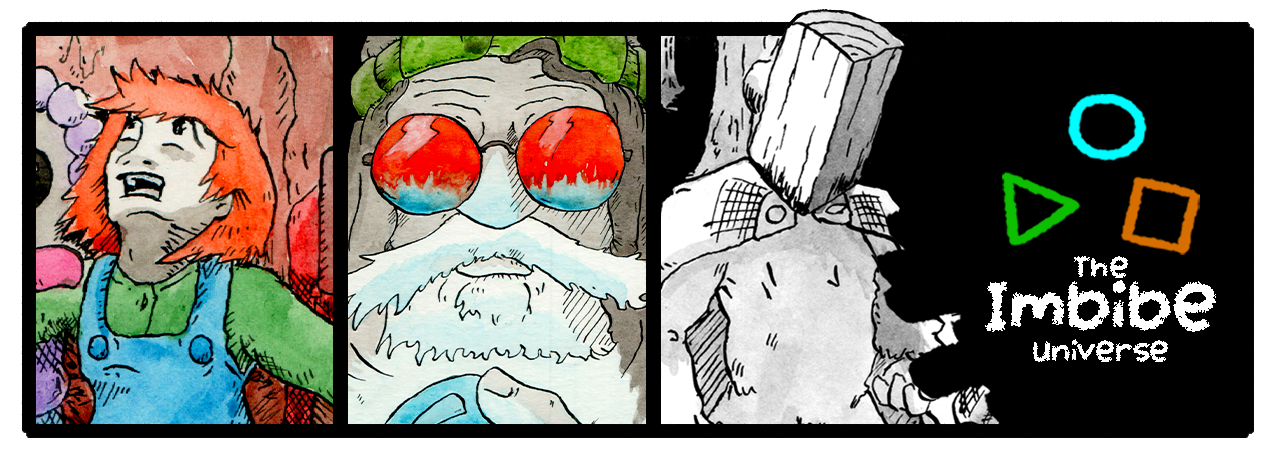
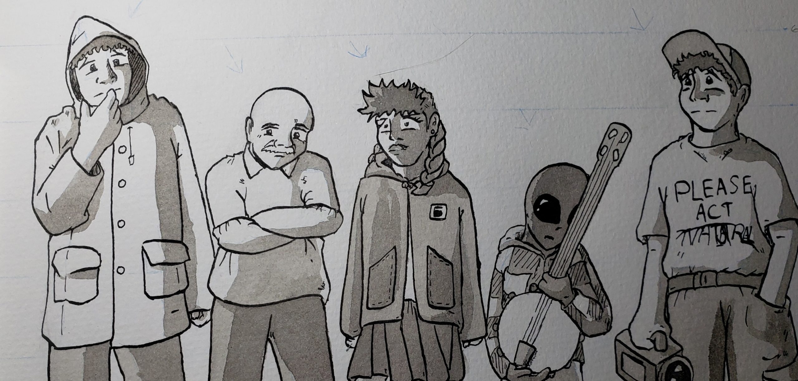
Color adds so much to a piece. I was reviewing pages from Deep Circuitry and noted that a lot of the lower illustration skill can be forgiven because of the color.
And then I saw the new Teenage Mutant Ninja Turtles movie and started thinking “how can I add color to my next project”?
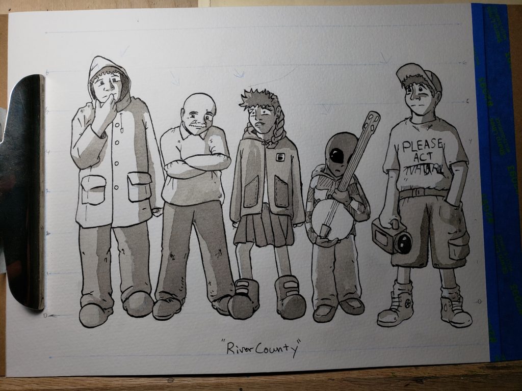
Cons: Color theory is challenging and hard to get right. Fixing analouge color is challenging to fix in digital post. Color (done well) will be time consuming. Painting analouge color will be challenging to keep consistent for 100 pages. B&W is fast. B&W is classic.
Pros: Color (done well) looks fuckin’ great.
Well. Okay. Lots of cons, but the one pro outweighs them all. Great…
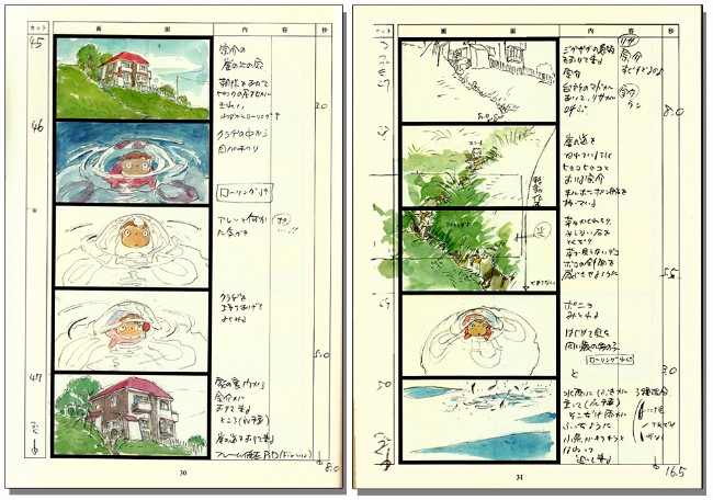
I think what I’ll consider is borrowing from Hayao Miyazaki’s method of minimally watercoloring his storyboards. From the Studio Ghibli movie, Ponyo:
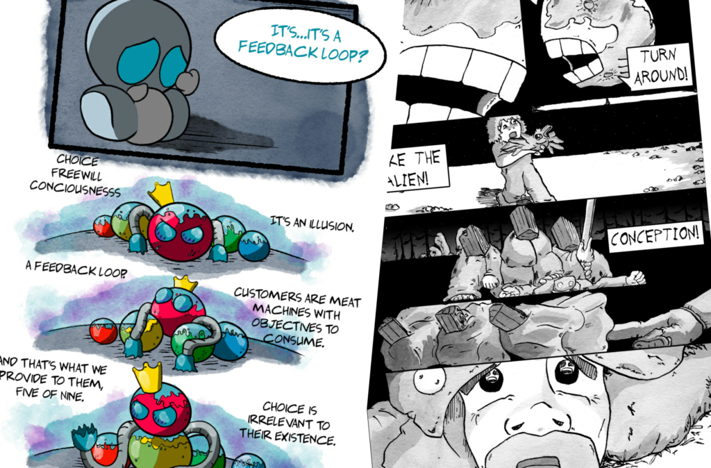
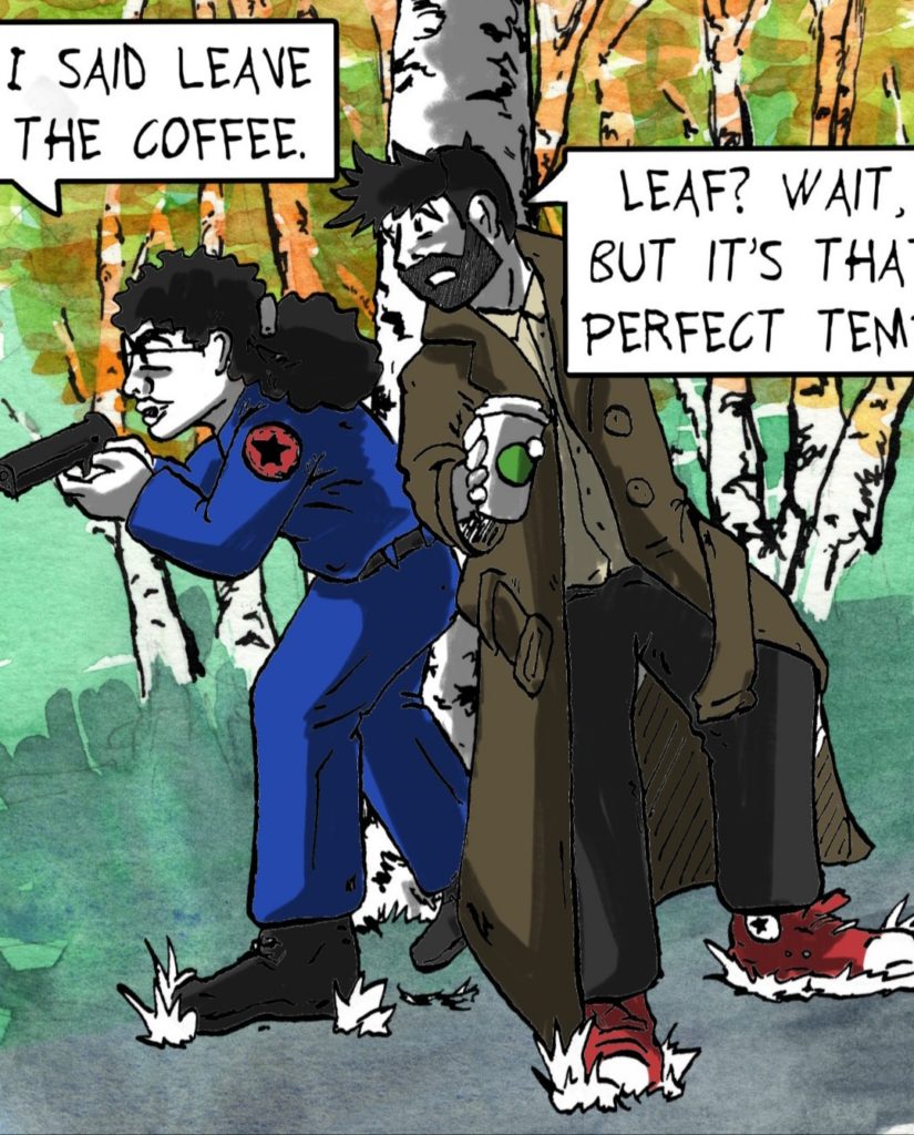
Or, perhaps even keeping the process analouge up until color is required, and maybe doing color digitally. This would be faster and quicker to recover from mistakes. I’d probably even consider doing focus areas with cell, and everything else in watercolor style. This is the same method I used for Deep Circuitry. For example:
At this point, it’s a matter of exploring how it will fit within my current work schedule.
If script and thumbnail exist, then-
– Thursday: sketch
– Friday: ink
– Monday: ink wash
– Tuesday: digital touch up and lettering
– Wednesday: post and publish
There’s quite a bit of room within these 2 hour sessions, especially since I’ve been slacking (not waking up on time, not spending the full time actually working).
